
It’s time to stop neglecting your bathroom. Small yet essential, this space deserves some design love, too. One of the simplest ways to transform a powder room or primary bath into a spa-like escape is with paint, an affordable update that delivers a major impact.
Below, interior designers share seven calming Benjamin Moore colors they turn to again and again to make any bathroom feel like a luxurious retreat.
Gray Sky
Michael Vincent Parks with DDReps; Design by Pistachio Designs
If you’re looking for a calming bathroom color that isn’t white or off-white, consider Gray Sky, which Elaine Burns Thompson, founder of Pistachio Designs, used in a recent renovation project.
“It still feels like a soothing neutral base,” Thompson says. “I especially love it for a kiss of color while still brightening up a bathroom that may have limited (or zero!) access to natural light.”
Soot
Laura Moss Photography; Design by Ellie Mroz Design
Bring a sense of drama and calm to the bathroom with the help of Soot. “The inky, near-black charcoal heightens architectural elements and adds a high-design aesthetic,” says Ellie Mroz, founder of Ellie Mroz Design.
At the same time, its deep, enveloping tone creates a cocooning effect that can feel surprisingly soothing. In this space, she layered in lighter wood tones for welcome contrast and balance.
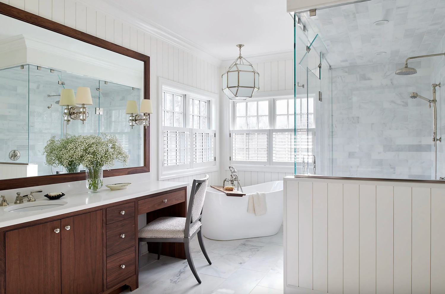
Simply White
Rebecca McAlpin; Design by Liza Nicole Interiors
Liza Nicole Angelucci, founder of Liza Nicole Interiors, revived a dated, pinky-taupe bathroom with some fresh coats of Simply White.
“The result is an inviting space that brings the light in and allows my clients to really see their beautiful outdoor greenery,” she says.
Hale Navy
Shelby Bourne; Design by Julia Adele Design
Julia Newman, founder of Julia Adele Design, is always thrilled to incorporate Hale Navy into a bathroom. “It strikes the perfect balance between soothing and enveloping,” Newman says. “The richness of the color creates a calming, cocoon-like atmosphere that’s ideal for a space meant for slowing down and unwinding.”
Better yet, Newman adds, the deep hue really sections off the bathroom as its own space. “Rather than feeling like an extension of an adjacent bedroom or hallway, the depth of the color gives the bathroom presence and intention,” she reflects.
Early Frost
Petra Ford; Design by Elizabeth Drake Interiors
Interior designer Elizabeth Drake likes to “find wall colors that love to be contrasted with white” so as to best accommodate the many white fixtures within bathrooms. Early Frost is one of her favorites.
“My key to selecting a pale blue color is to look for the bluest colors in the gray-neutral section of the paint deck, then paint a large swatch on foam core so the color can be more readily seen,” Drake says.
Downpour Blue
Emily Minton Redfield; Design by Andrea Schumacher Interiors
Andrea Seymour, founder of Andrea Schumacher Interiors, leaned into the power of paint when it came to this bathroom. “After being deeply involved in the architectural detailing and construction of the home, by the time we reached this space there were fewer layers left to rely on—no elaborate millwork moments, no heavy material shifts,” Seymour says. “It needed to stand on color alone.”
The hue for the job? Downpour Blue. “It wraps the room in confidence, creating drama without ornament and richness without excess,” she says. Despite its intensity, the saturated blue brings a steady, grounding presence to the space, giving the room a serene, retreat-like feel.
Chantilly Lace
Peak Visuals; Design by Elana Designs
Another white that designers keep coming back to is Chantilly Lace, which designer Elana Mendelson considers to be one of her favorite white shades of all time. “It is a crisp, clean, neutral white that brings instant freshness and warmth to a bathroom without feeling sterile or cold,” Mendelson says.
Sarah McCarty, founder of Sarah McCarty Interiors, is also a fan of the color. “Chantilly Lace always creates a crisp, timeless backdrop that allows tile, wallpaper, and colorful accents to stand out,” she says.